01 Overview
Role: UX Designer - competitor analysis, user personas, wireframing & prototyping.
Tools: Figma
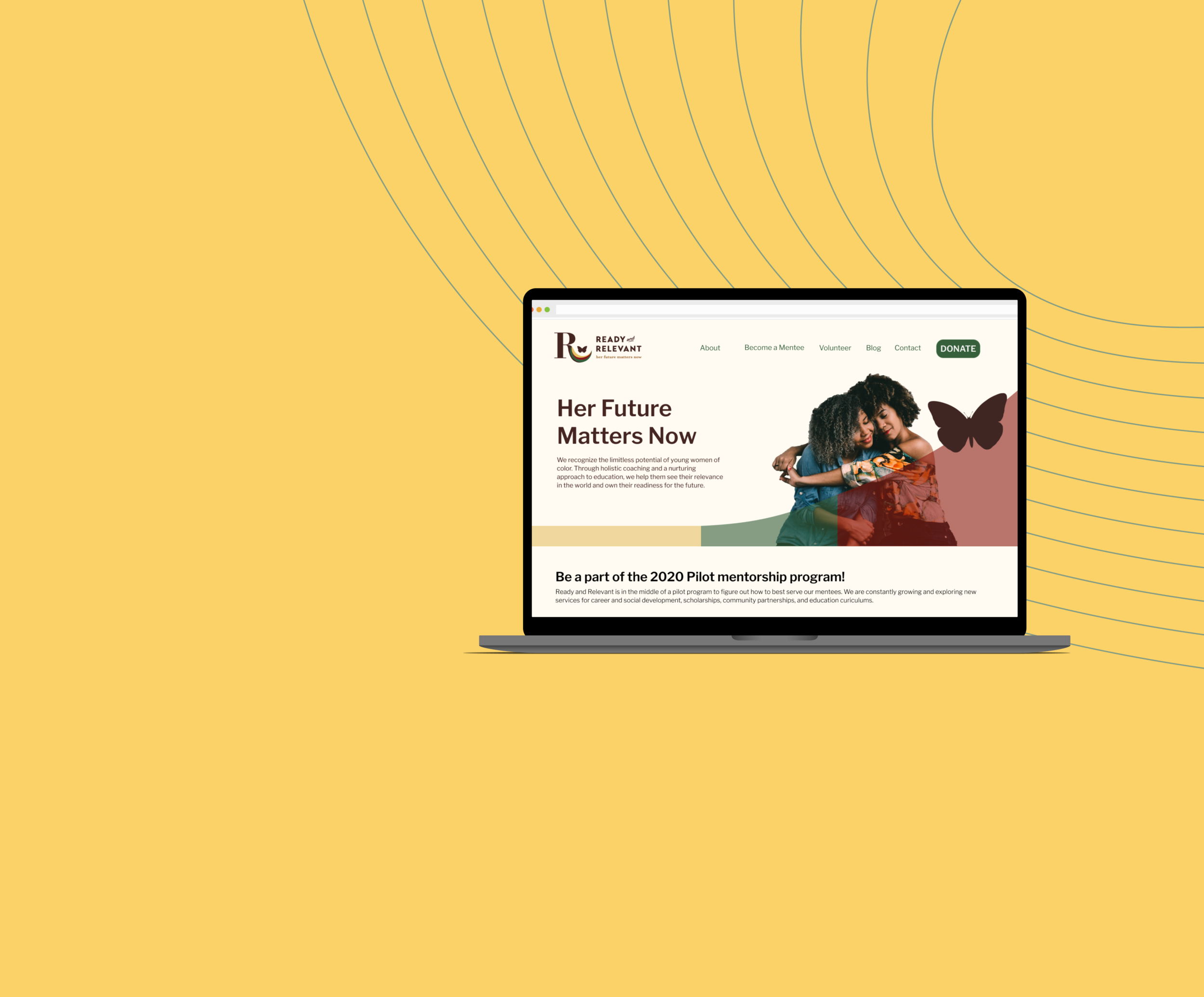
Introduction: Ready and Relevant is a non-profit organization based in Minneapolis that supports and mentors young women of color by providing financial support, life coaching, and many other forms of aid. Their website includes toolkits and resources, blogposts, and mentorship program information. The client requested a website redesign for the organization. We decided on 3 main goals for the redesign to provide a more accessible navigation and overall organization of the website content.
Main goals:
Be transparent about donations: what donations go towards and how to donate
Always include clear and direct navigation of the website
Provide a good experience for users
02 Process
Research
Competitor Analysis
My team and I decided to emphasize transparency of donations and making the website detailed for donors, mentors, and mentees.
Our initial steps of research included a competitor analysis to see how our website would compare to other non-profit organizations, specifically those that involve supporting and/or mentoring young women of color. Our research showed that these websites targeted donors and volunteers and often provided mentorships or classes for teens and young adults. They also excelled in describing what the organization and programs do but lacked transparency in donation allocations.
Pre-Design Interviews
In our users interviews, we used a card sort to determine how participants organize the information on a page.
Interviews consisted of asking participants their experiences with donating to an organization. This gave us a better understanding of general pain points, what individuals look for when donating, and how they find transparent information about the organization. Although I was brought onto the team later and was not involved with majority of the initial research, I led several pre-design interviews and gain understanding of how to conduct an interview with a participant.
Key findings from initial interviews
3. User Personas & Navigation
I created 2 different user personas that would reflect the two main groups who would be interacting with the website, which are the mentees and donors. I included possible needs and frustrations, which helped my team understand how to design so that these requests are met.
The final step in the research phase was creating a site map, which the general outline of the navigation of the website.
Design
4. Ideation and Design
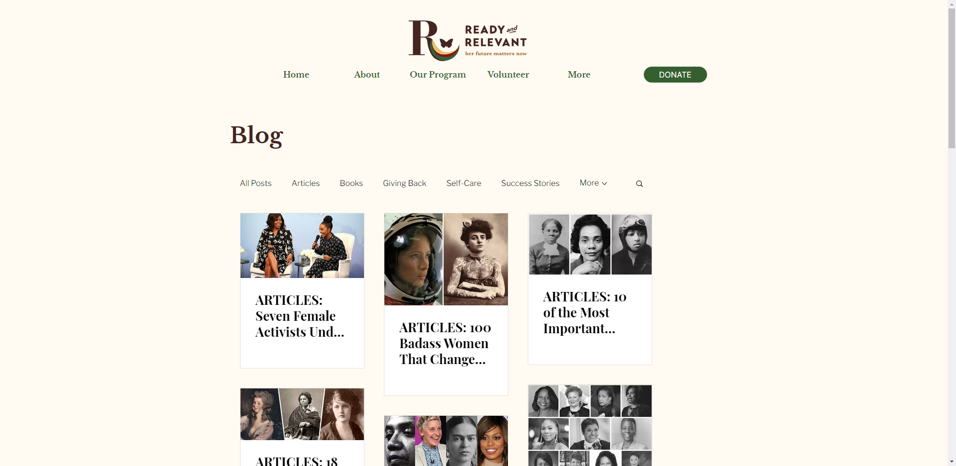
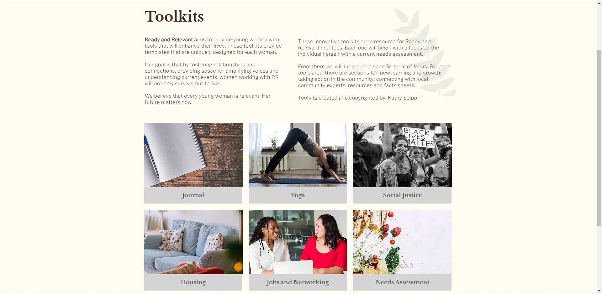
The main portions of ideation and design included sketches, wireframes, and hi-res prototypes. Before designing wireframes, the components for essential website sections, such as the about and contact information, were gathered first. I was responsible for designing the blog pages, donation pages, and toolkits (which are resources for the mentee to utilize during the program). We created the navigation bar according to our analysis from user interviews and began designing from that point.
While working on the wireframes, we collaborated with the creative director in choosing a color palette and typography for branding.
5. Hi-Res Prototypes
After discussion and revising with our client, we transferred the updated wireframes into Wix and uploaded the information from the previous website. In addition to designing the blog, donation, and toolkits pages I was responsible for transferring the information from the previous website to the new one.
03 Final Wireframes & Prototype
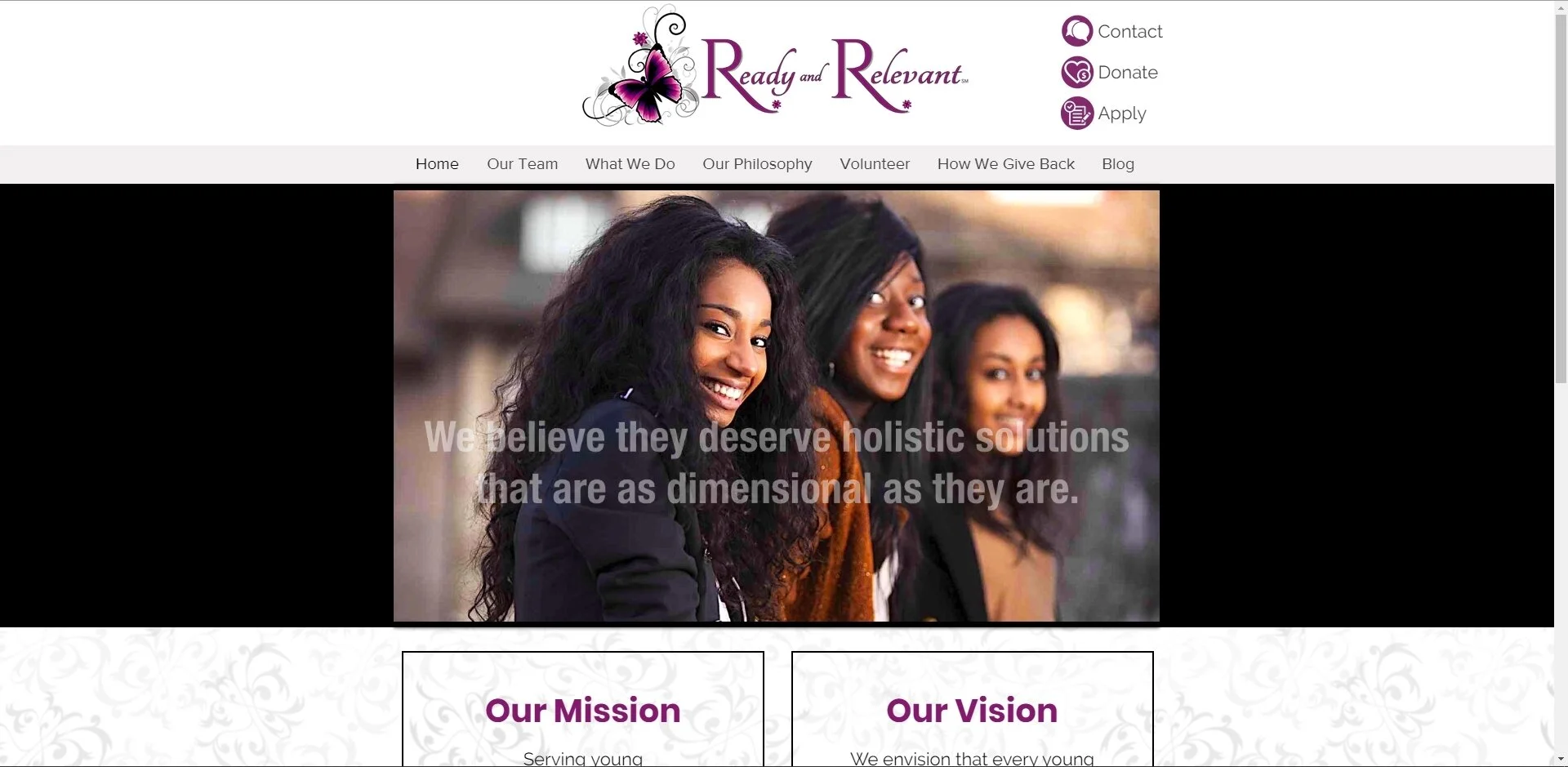
Here are the before and after screens of the website.
Homepage:
Blog:
04 Final Thoughts
This was my first official project after graduating from my certificate program and I am very thankful for Elena for finding me on Hexagon UX and offering to help me grow my design skills. Without this experience, I wouldn’t have been able to gain real work experience and have met amazing people in this new journey. I learned the value of teamwork and the importance of communication amongst coworkers.
other works!
connect with me!


