01 Overview
Role: UX Designer - competitor analysis, user personas, user interviews, final prototyping.
Tools: Figma
Introduction: A UX Designer (Erika Fortune) and I were approached by a client who wanted a website designed so that she can share Black history and the Black experience in America, as a tool for personal education and awareness of racial injustice. Our main goal was to update the aesthetics and navigation of the original website and increase trust of the website and the validity of its sources.
02 Process
Research
Competitor Analysis
I searched several websites from organizations that focused on the retelling and teaching of Black history, which included the Smithsonian and the Study of African American Life and History (ASALH).
Our research phase consists of competitor analysis, personas, pre-design/user interviews, and site maps & information architectures/IA’s. Competitor analysis showed that trending themes included links to the organization’s social media handles and clarity of the mission and reason for creating the website.
User Interviews and OOUX (object-oriented UX) map
User interviews gave us a sense of how users group together information into different categories.
From these user interviews, we created an OOUX map to compare and analyze the data results. The OOUX map gives us a visual representation of how the participants grouped together certain terms in a manner that made the most sense to them. Seeing these groupings allow us to create a navigation that was essentially created by the users. With this, we worked on a site map to organize the website’s overall flow.
3. Site Map
Design
4. Wireframes
Initial wireframes focused heavily on the main portion of the website’s purpose; the blog posts.
This design highlighted the articles on the website by displaying the main navigation category at the top then dividing into subcategories towards the middle and bottom of the page. We also worked with a branding specialist and the client to create a color scheme that reflected the Black experience.
03 Final Wireframes & Prototype
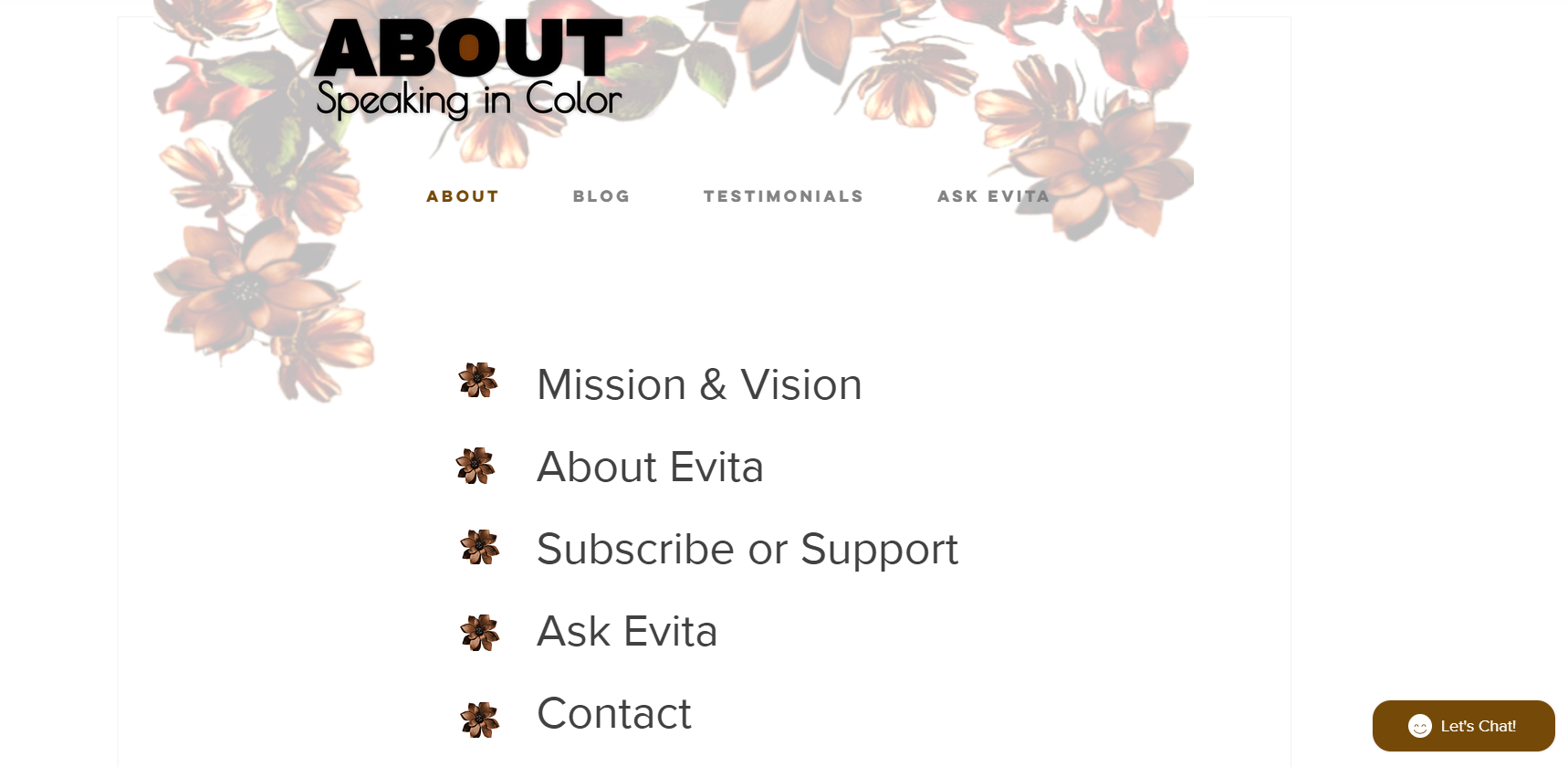
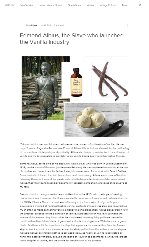
Here is what the Speaking in Color website looked before and after:
“About page”
Main blog posts page
Example of a blog post
In the hi-fi prototypes, we created clear headlines and descriptions and transparency of the mission and vision of the website.
04 Final Thoughts
It’s inspiring to work on another website design because you can see the drastic differences in the before and after of taking users and website visitors into consideration. The website may make sense from the creator’s perspective but can often look chaotic for the intended audience. With the changes that Erika and I made, we simplified the navigation, increased trust between readers and author, and clarified the mission and purpose.
other works!
connect with me!


